David Slack - Web developer

Search:
- 29 North
- Act Maintenance Solutions
- Ady Mills
- Arm & Eye
- Documenting the Mundane
- DS Card
- Ebay shop - Tech Genome
- Elevator Studios
- ESS Newton
- Farango
- Lilly Grove
- Lost and Found
- Lucky Fingers
- Luna
- My BubbleBee
- My website
- Relish
- Rotary Club of Liverpool
- SATandCABLE
- Senua Digital
- Senua Hydroponics
- The Natural Apothecary
- Vehcam
- Wind in the Willows Child Care
Web design "Fold" myth
As a web developer and web designer I need to take into account everything on a site from SEO, marketing, usability across devices, the look and feel, UI, browser compatibility, etc, etc, etc. This is all fine and I'm happy with this.
But, over the years I've heard the term "Fold" and "Above the fold" and "The scroll" when designing websites. This is rubbish!!
http://www.whereisthefold.com/
This site shows some of the older "Fold" on websites, but it is useless and wrong today.
The medium (browser) will resize so the "Fold" will move up and down, the user can have lots of toolbars which will push the "Fold" down further, even at full screen the resolution of the monitor can be between 600px and 1536px on the new high res monitors (and going up). Then we have mobile devices with resolution that "zooms" so we have between 320px and 1536px height "Fold".
Mobile Web Best Practices is closer to the truth here:
http://mobilewebbestpractices.com/visual-design/freak-out-about-the-fold/
but I don't think it is enough.
The "Fold" on a website is somewhere between the size of a stamp and the size of a TV. The web is NOT print, most print analogies don't work because print medium is static where the web is available on everything from PC's to fridge freezers and the medium will change, not from device to device but from person to person on each device they have.
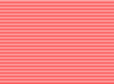
If you still have trouble with the "Fold" and want a real world working up-to-date "Fold" check the image to the left, every red and white line can be a "Fold" on a device.
So, when a client starts to say "What about the Fold?" or "Where is the Fold?" point them here and tell them some marketing idiot who has no understanding of the web has been talking rubbish in their ear.
Latest content
Social networks
Contact me here or catch me on one of
the social networks below
Off-site News
My blog
Try this on your mobile

You should be able to use this right from the screen
Latest tweets
Calendar
| M | T | W | T | F | S | S |
|---|---|---|---|---|---|---|
|
|
|
1 |
2 |
3 |
4 |
5 |
|
6 |
7 |
8 |
9 |
10 |
11 |
12 |
|
13 |
14 |
15 |
16 |
17 |
18 |
19 |
|
20 |
21 |
22 |
23 |
24 |
25 |
26 |
|
27 |
28 |
29 |
30 |
|
|
|
Copyright David Slack - Web developer


