David Slack - Web developer

Search:
- 29 North
- Act Maintenance Solutions
- Ady Mills
- Arm & Eye
- Documenting the Mundane
- DS Card
- Ebay shop - Tech Genome
- Elevator Studios
- ESS Newton
- Farango
- Lilly Grove
- Lost and Found
- Lucky Fingers
- Luna
- My BubbleBee
- My website
- Relish
- Rotary Club of Liverpool
- SATandCABLE
- Senua Digital
- Senua Hydroponics
- The Natural Apothecary
- Vehcam
- Wind in the Willows Child Care
Design in Fireworks
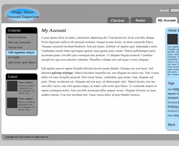
Fireworks is without doubt my favourite software find of the last few years. It has all the best parts of Photoshop and Illustrater for web designers. It uses vectors to create and it allows you to output in a range of bitmaps, for layout it is an amazing tool.
- Open Fireworks CS4
- Click Fireworks Document (PNG) on the right
- Width = 1200
- Height = 2000
- Canvas color = #000000
- Click OK
Now we have an empty canvas so we'd better start to fill it up, but first lets change the layout. There are many ways to view the tool bars and canvas on Fireworks, I have chosen EXPANDED MODE
- On the top right next to the search bar hit the pull-down
- Choose expanded mode
Now to build a layout
- On the left (under Vector) click Rectangle (it'll say Rectange tool (U) if you mouse over)
- At the bottom under Properties hit the square next to the paint bucket to choose a colour, choose the grey #999999
- Draw a square on the black canvas any size and shape as long as it is only on the black
- Press v on the keyboard (to get the pointer on) and click on the white rectangle
- On the bottom under Properties change the following:
- W = 980
- H = 650
- X = 110
- Y = 20
- Roundnes 20px (use th pull-down to change % to px)
- Click on the + next to Filters and under 'Shadow and Glow' choose 'Glow'
- Change the '65%' to '15%' and the red box to black (#000000)
- Now to change the colour of the canvas to grey. Click the background (black area)
- Click the black box next to the word Canvas under properties
- Choose a light Grey (#CCCCCC)
- Draw a second rectangle:
- White #FFFFFF
- W: 980
- H: 530
- X: 110
- Y: 110
- Download the atached logo and drag it onto your Fireworks document
- For the properties use:
- W: 189
- H: 85
- X: 120
- Y: 25
- Draw another box with the properties:
- W: 180
- H: 490
- X: 890
- Y: 131
- Roundness: 15px
- Colour: #AEDFFF (light blue)
- Click on the + next to Filters and under 'Shadow and Glow' choose 'Drop Shadow', change '65%' to '30%' (remember thes settings, we use them when I refer to Drop Shadow from now on)
- The next box has properties of:
- W: 150
- H: 200
- X: 130
- Y: 130
- Colour: Black (#000000)
- Roundness: 15px
- Dropshadow (see baove for details)
- The next box has properties of:
- W: 148
- H: 155
- X: 131
- Y: 260
- Colour: Grey (#999999)
- The next box has properties of:
- W: 101
- H: 54
- X: 615
- Y: 82
- Colour: Grey (#666666)
- Roundness: 10px
- Dropshadow (see baove for details)
- Now this last box is a tab, but it doesn't look like one yet. Press v on your keyboard (for the pointer tool) and click the latest box to select it. Now press and hold Ctrl on your keboard then tap the down arrow. Keep hold of Ctrl and tap down again. Keep doing this until the laets box gowes 'under' the white box (if it goes under the grey hold Ctrl and press up)
- Select the 'Text tool' by pressing 't' on your keyboard
- Click in the middle of your screen
- Under properties choose 'Times New Roman' as the font
- Choose 16 as the size (next to Regular)
- The colour is grey (#CCCCCC)
- The B (bold) and I (italic) should be selected
- Type the word 'Contents' (no speach marks)
- Press Esc key on your keyboard to stop inputting text
- Press v to choose the pointer and add these properties
- W: 64
- H: 22
- X: 139
- Y: 135
You can build up the rest of the design using these techniques, but I've attached the whole design as a png to open in fireworks CS4 if you want to save time.
Now we have a design we will turn it into a we create the website then add the design to it by creating a theme
BUT, before we turn our lovely design into a Theme we want to create the website, for this we will use the Drupal CMS, so read on
Latest content
Social networks
Contact me here or catch me on one of
the social networks below
Off-site News
My blog
Try this on your mobile

You should be able to use this right from the screen
Latest tweets
Calendar
| M | T | W | T | F | S | S |
|---|---|---|---|---|---|---|
|
|
1 |
2 |
3 |
4 |
5 |
6 |
|
7 |
8 |
9 |
10 |
11 |
12 |
13 |
|
14 |
15 |
16 |
17 |
18 |
19 |
20 |
|
21 |
22 |
23 |
24 |
25 |
26 |
27 |
|
28 |
29 |
30 |
|
|
|
|
Copyright David Slack - Web developer


